User Guide - Pulse AI
Pulse AI is an intelligent performance and team analytics module within User Activity Audit Log that translates raw Jira activity into actionable coaching insights, radar charts, and team health metrics. The broader product already supports rich audit exploration, and Pulse AI builds on that with AI-oriented interpretation and leaderboard views.
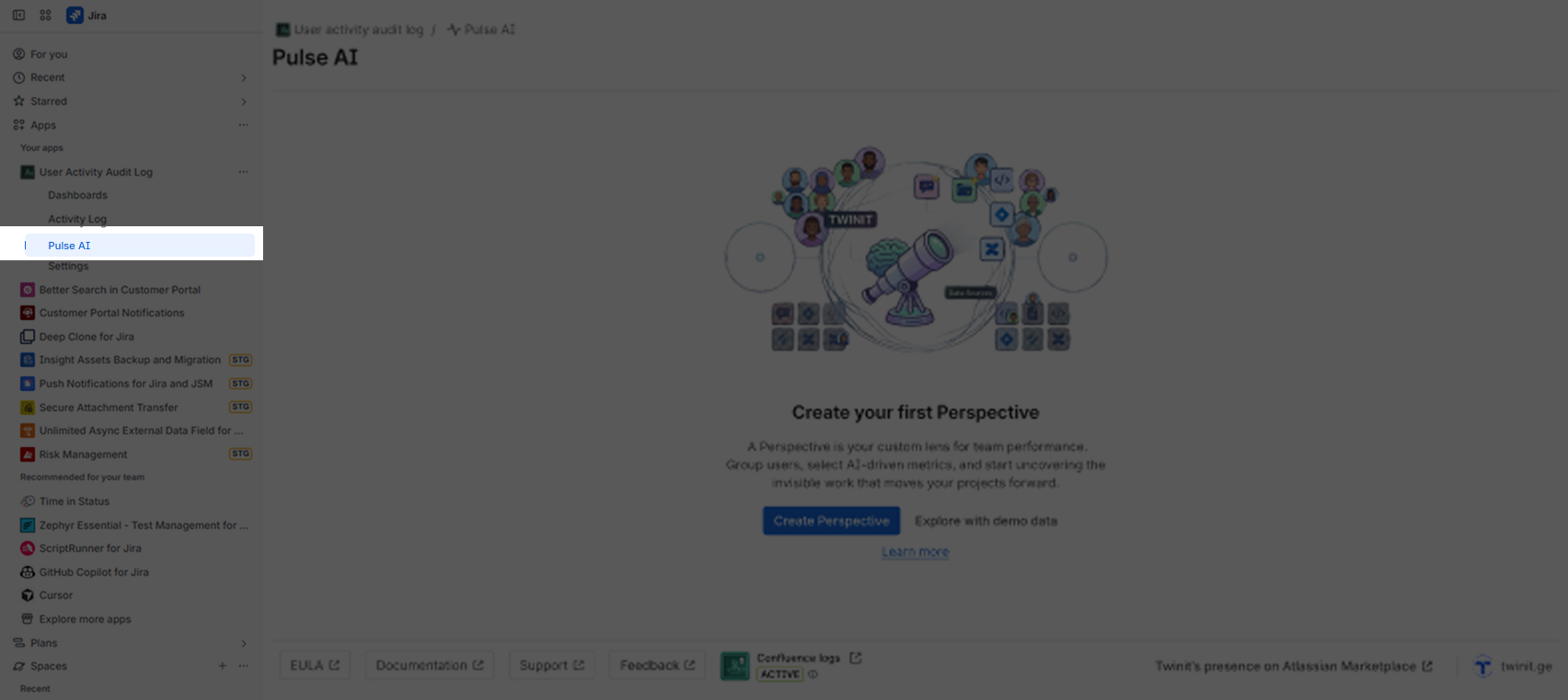
Create Perspective
Before you can start using Pulse AI, you must first create a Perspective. Click the “Create Perspective” button to proceed. Here you need to fill these fields:
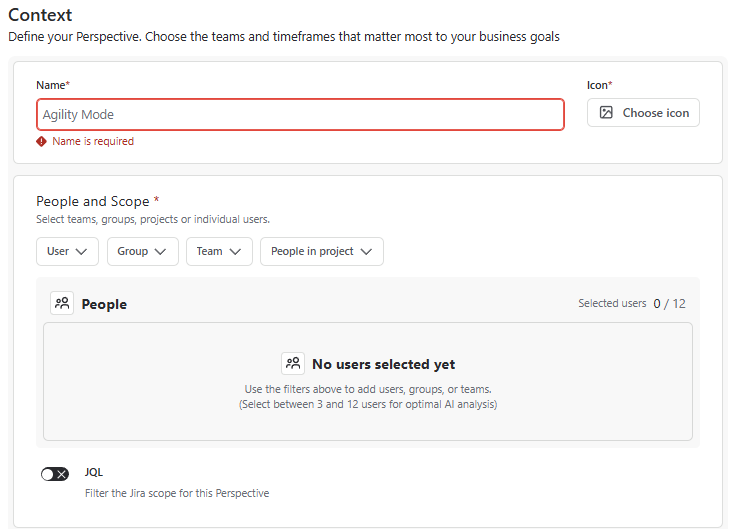
Step 1 : Context
Name
Icon
People and Scope
- Select Users
- Select Groups
- Select Teams
- Select People In Project
JQL
- Filter the Jira scope for this Perspective
AI Evaluation Window
- Days
- Weeks
- Months
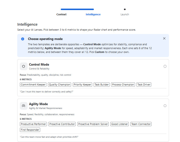
Step 2 : Intelligence
Choose an operating mode**.** The two built-in templates are deliberate opposites:
- Control Mode optimizes for stability, compliance and predictability.
- Agility Mode for speed, adaptability and market responsiveness.
Each one sets 6 of the 12 metrics below, and between them they cover all 12. Pick Custom to choose your own.
You can also choose Custom operating mode and pick between 3 to 6 metrics to shape your Radar chart and performance score.
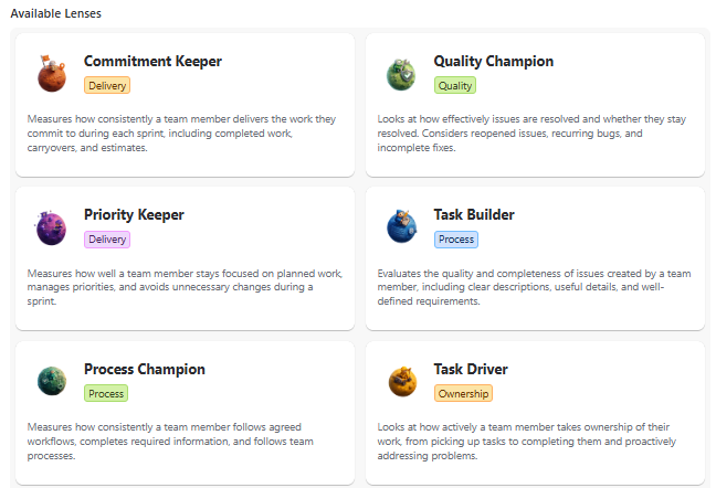
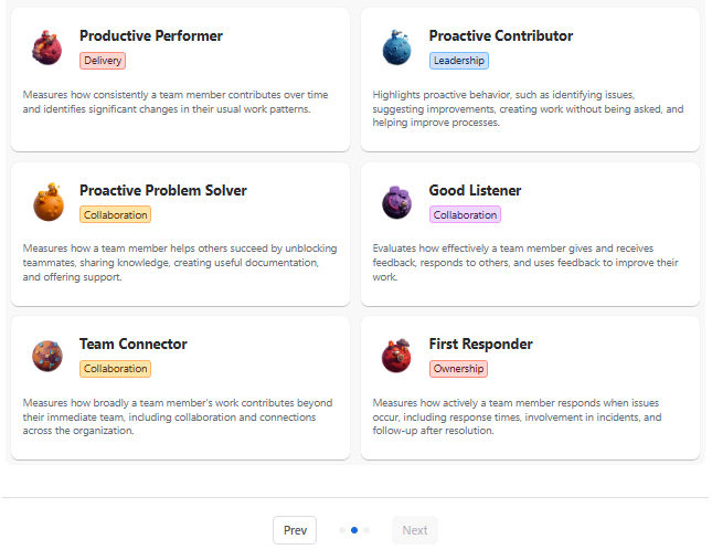
Available Lenses
| Card Name | Description |
|---|---|
| Commitment Keeper | Measures how consistently a team member delivers the work they commit to during each sprint, including completed work, carryovers, and estimates. |
| Quality Champion | Looks at how effectively issues are resolved and whether they stay resolved. Considers reopened issues, recurring bugs, and incomplete fixes. |
| Priority Keeper | Measures how well a team member stays focused on planned work, manages priorities, and avoids unnecessary changes during a sprint. |
| Task Builder | Evaluates the quality and completeness of issues created by a team member, including clear descriptions, useful details, and well-defined requirements. |
| Process Champion | Measures how consistently a team member follows agreed workflows, completes required information, and follows team processes. |
| Task Driver | Looks at how actively a team member takes ownership of their work, from picking up tasks to completing them and proactively addressing problems. |
| Productive Performer | Measures how consistently a team member contributes over time and identifies significant changes in their usual work patterns. |
| Proactive Contributor | Highlights proactive behavior, such as identifying issues, suggesting improvements, creating work without being asked, and helping improve processes. |
| Proactive Problem Solver | Measures how a team member helps others succeed by unblocking teammates, sharing knowledge, creating useful documentation, and offering support. |
| Good Listener | Evaluates how effectively a team member gives and receives feedback, responds to others, and uses feedback to improve their work. |
| Team Connector | Measures how broadly a team member’s work contributes beyond their immediate team, including collaboration and connections across the organization. |
| First Responder | Measures how actively a team member responds when issues occur, including response times, involvement in incidents, and follow-up after resolution. |
Step 3 : Launch
Here you can control who gets access to these insights , choose the Visibility and click “ Launch Perspective ” :
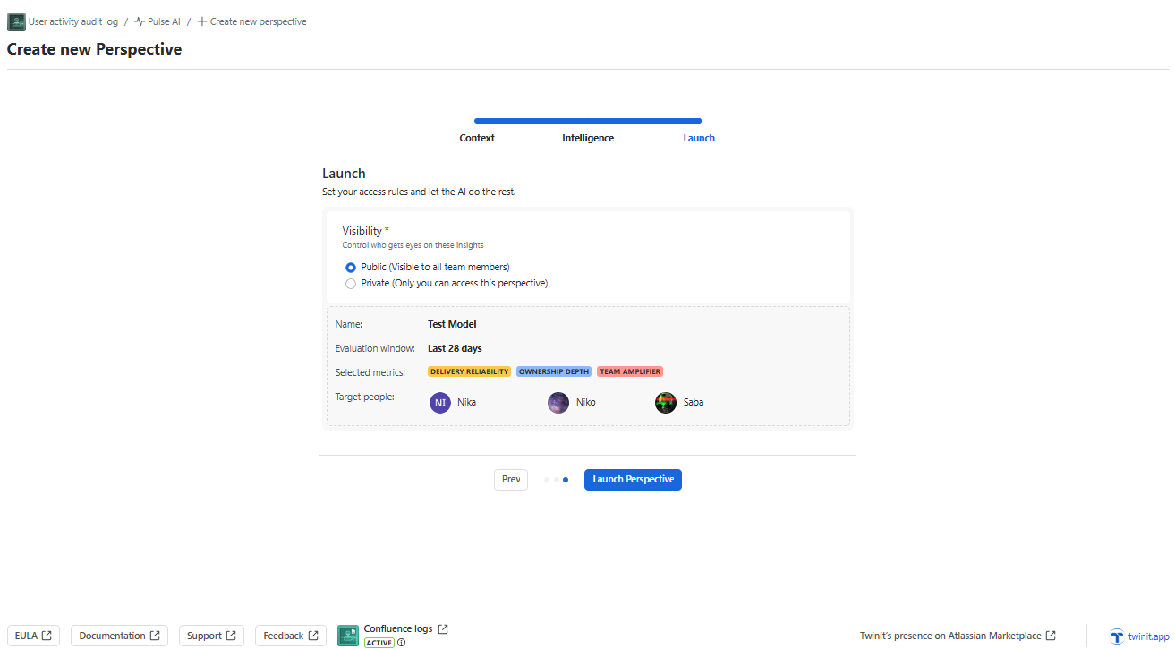
After creating a Perspective, the system automatically displays a visualization of the relevant data and insights.
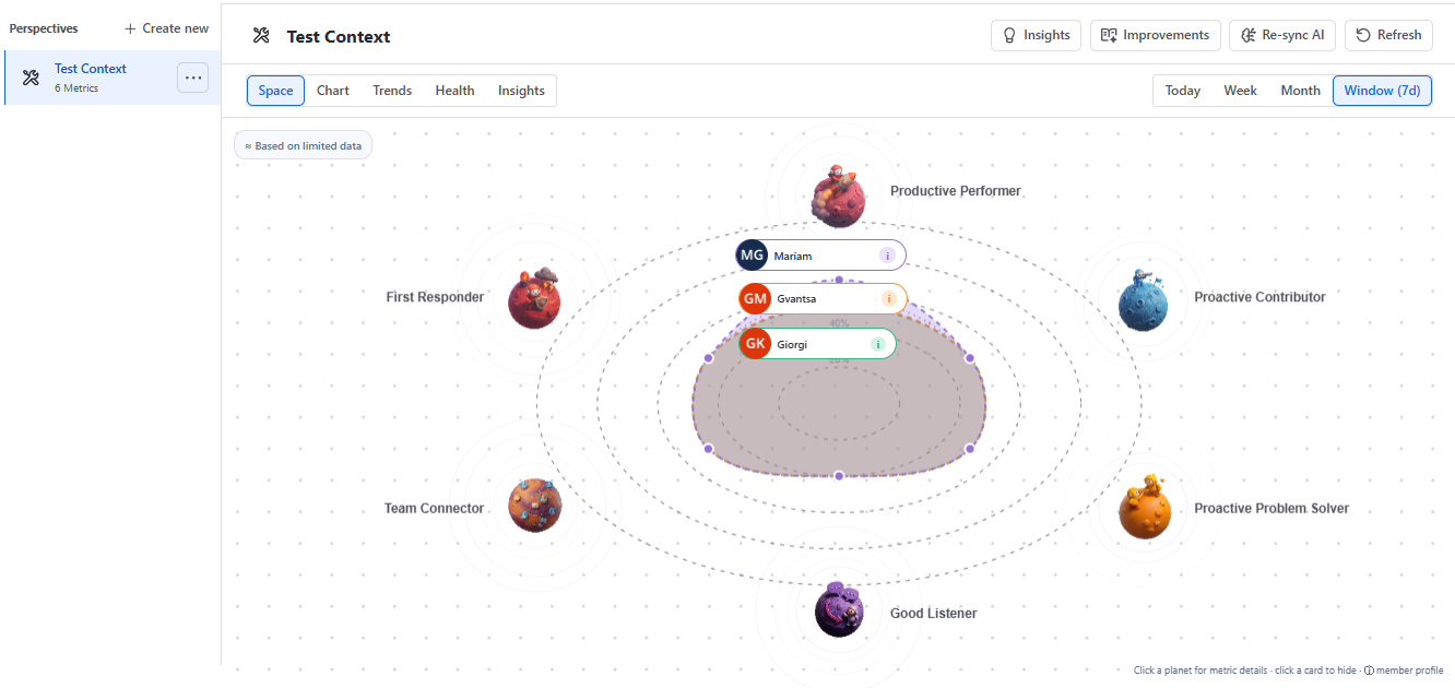
Scoring Model
Pulse AI scores are built on two layers working together:
Layer 1 — Base Performance Score (configurable weights)
Each user gets a Performance Score calculated from their raw Jira activity within the Perspective’s scope (JQL filter + AI Evaluation Window). The inputs are:
| Signal | What it measures |
|---|---|
| Activity volume | Total count of tracked actions |
| Activity type weight | Each type (comments, status transitions, field updates, issue creation, assignment changes, worklogs) has a configurable weight |
| Time distribution | How activity spreads across the evaluation window (consistency vs spikes) |
| Cross-project participation | Breadth of contribution across projects |
The formula is visible and configurable by admins — meaning organizations set the weights per activity type to match their priorities. The system is explicitly designed to be auditable: every score is traceable back to the underlying activities, applied weights, and time range.
Layer 2 — AI Lenses (Rovo evaluation)
On top of the base score, admins pick 3 to 6 AI Lenses that form the radar chart. Each lens is an independent AI-evaluated dimension:
- Commitment Keeper — commitment rate, carryovers, estimation discipline
- Quality Champion — reopen rates, recurring bugs, silent closes
- Priority Keeper — scope creep, mid-sprint re-additions, context switching
- Task Builder — issue hygiene, completeness, acceptance criteria
- Process Champion — workflow compliance, mandatory fields, retro participation
- Task Driver — self-assignment, end-to-end completion, proactive updates
- Productive Performer — week-over-week predictability, boom/bust detection
- Proactive Contributor — self-discovered issues, RFCs, process improvements
- Proactive Problem Solver — unblocking others, shared docs, proactive help
- Good Listener — comment quality, response times, feedback incorporation
- Team Connector — cross-org contribution breadth
- First Responder — P1/P2 response, voluntary involvement, post-mortem authorship
Rovo processes the Jira activity data through these lenses and produces per-user scores for each. The combined lens scores shape the radar chart visualization.
You can view scoring information for each user. To do so, click the Info icon next to the user’s name. A corresponding window will then appear with the user’s scoring details:
Score
- Overall score (0–100) for the selected period. Weighted blend of the dimensions below
Percentile
- Standing within this perspective’s cohort
Trend
- Overall score vs. the previous period of the same length: up/down when it moved by more than 5 points, stable otherwise. ‘new’ means there is no prior period to compare
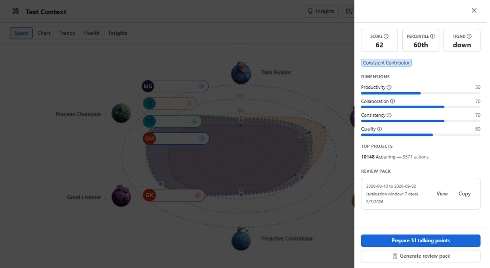
Prepare 1:1 Talking Points & Generate Review Pack
For each user, you can individually generate 1:1 meeting recommendations or access the Review Pack, which provides a summarized review based on the relevant user-specific information:
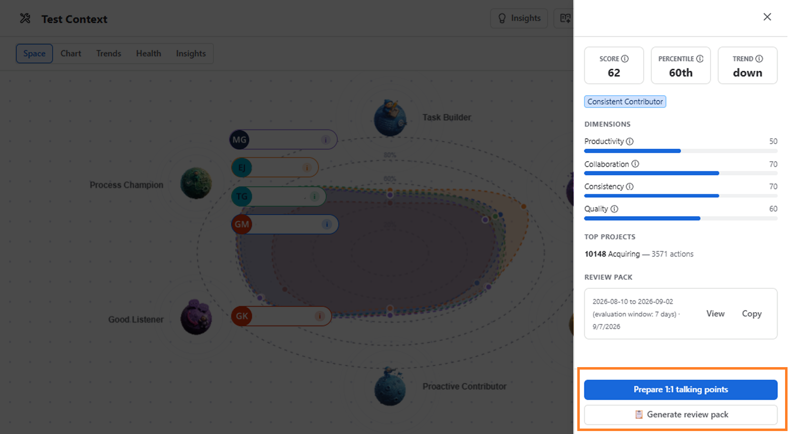
Chart View
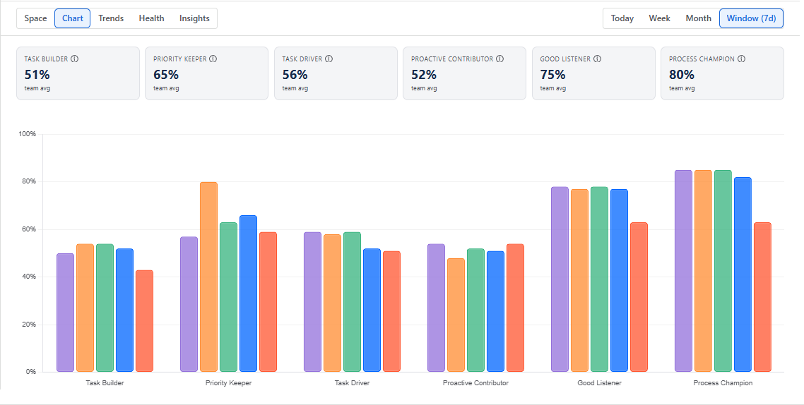
After creating a Perspective and generating the information, you can switch from Space View to Chart View.
From here you can see the generated information broken down by the selected AI Lenses.
When you hover over the bars in the chart, you can see the specific users and the percentage to which each user matches the corresponding AI Lens:
Trends
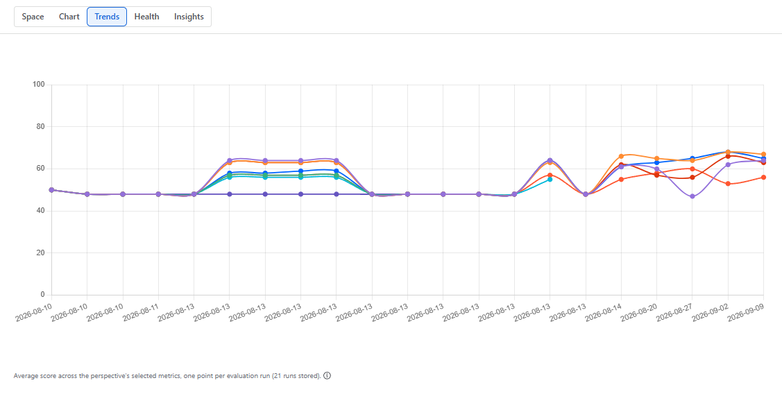
Trends start from the first evaluation after the perspective is created — earlier history is not backfilled. Each run still looks back over the evaluation window, so work from shortly before creation is reflected in the first scores.
Activity and sprint data are only captured live, and the last 26 runs are kept (about 6 months at weekly cadence).
Health
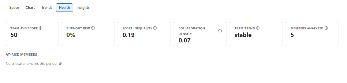
Here you can see team health information:
Team avg score
- Average overall activity score (0–100) across all analyzed members for this period.
Burnout risk
- Share of members showing burnout signals such as sudden activity drops or overload anomalies. Under 15% is healthy; 30%+ needs attention.
Score inequality
- Gini coefficient of how evenly scores are spread across the team: 0 = perfectly even, 1 = concentrated in a few people.
Collaboration density
- Average comments per action across the team — higher means more discussion and collaboration around the work
Team trend
- Direction of the team’s average score compared with the previous evaluation period.
Members analyzed
- Number of team members with enough activity to be included in this analysis.
Once the Burnout Risk needs attention, you will see the warning signs:

Actions
Insights
Insights button is essentially a contextual Rovo entry point — it launches Rovo with all the relevant Pulse data already loaded so you don’t have to explain the context yourself.
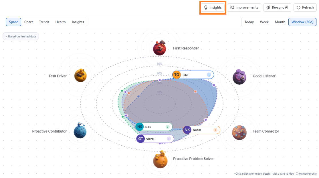
By clicking Insights button, it opens a Rovo chat session:
- Rovo opens with the context pre-loaded — the user’s activity data, the Perspective config (JQL scope, evaluation window, selected AI Lenses)
- Rovo then generates the narrative analysis as a chat response — contribution patterns, trends, outliers, explanations
- Because it’s a Rovo conversation, you can ask follow-up questions — drill deeper into specific lenses, compare time periods, ask “why did their score drop?”, etc.
Why Rovo:
This design means Insights is interactive, not static. Instead of a fixed summary card, you get a conversational AI session where you can:
- Ask clarifying questions about a specific score dimension
- Request comparisons (“how does this compare to last sprint?”)
- Get deeper context (“what caused the drop in Delivery Reliability?”)
- Ask for actionable suggestions (“what should I discuss in our 1:1?”)
Improvements
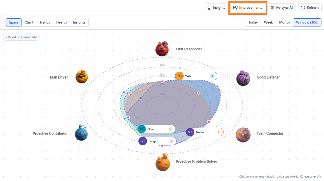
Once the generated visualization is ready, you can see The “Improvements” button, which triggers the AI evaluation engine for a given Perspective. When you click it, it:
Sends the Perspective’s configuration (selected users/teams, JQL scope, AI Evaluation Window, and chosen AI Lenses) to Rovo
“Rovo” processes Jira activity data through selected lenses and offers tips to improve team performance:
Re sync AI
Once the generated visualization is ready, you can see The Resync AI button:
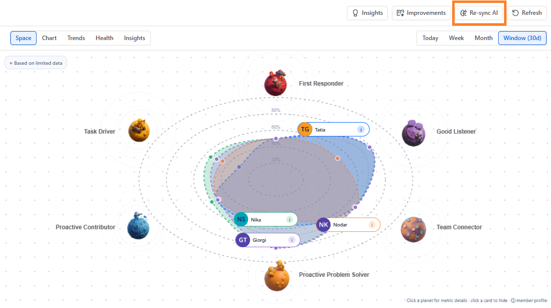
The Resync AI button triggers the AI evaluation engine for a given Perspective. When you click it, it:
- Sends the Perspective’s configuration (selected users/teams, JQL scope, AI Evaluation Window, and chosen AI Lenses) to Rovo
- Rovo processes the Jira activity data through those lenses (e.g., Delivery Reliability, Resolution Quality, etc.)
- Generates performance scores, radar charts, and AI insights for the users in scope
- After completion, you click the Refresh button to load the results on the Perspective page
Every time the underlying data changes — new activity is logged, the evaluation window shifts, or you modify the Perspective config — the AI scores need to be recalculated. The Resync AI button lets you manually trigger that recalculation on demand.
Users land on the Perspective page:
- Click Resync AI to start the evaluation.
- Confirm the run in the Rovo prompt.
- Click Refresh to display the updated scores and insights.
Perspective Actions
Create A New Perspective
You can create a new perspective by clicking “Create New” button:

Edit & Delete
You can Edit or Delete current Perspective by clicking three dots next to the selected Perspective:

FAQ
How often should I run Resync AI?
We recommend resyncing at the end of each sprint or prior to scheduled 1:1s rather than multiple times a day.
Do I need User Activity Audit Log before using Pulse AI?
Yes. Pulse AI depends on User Activity Audit Log being installed and configured.